Dueling Kitchens: Designer Vs. Contractor
Which Kitchen Is Better?
In a previous episode, Mint Construction laid down the gauntlet to see which kitchen in this Harrisonburg duplex would reign supreme. Which will be a better choice, the neutral tones of Matt's upstairs kitchen, or the bolder black-and-whites of Kate's downstairs room?
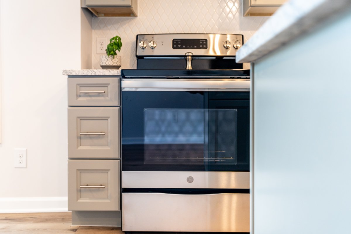
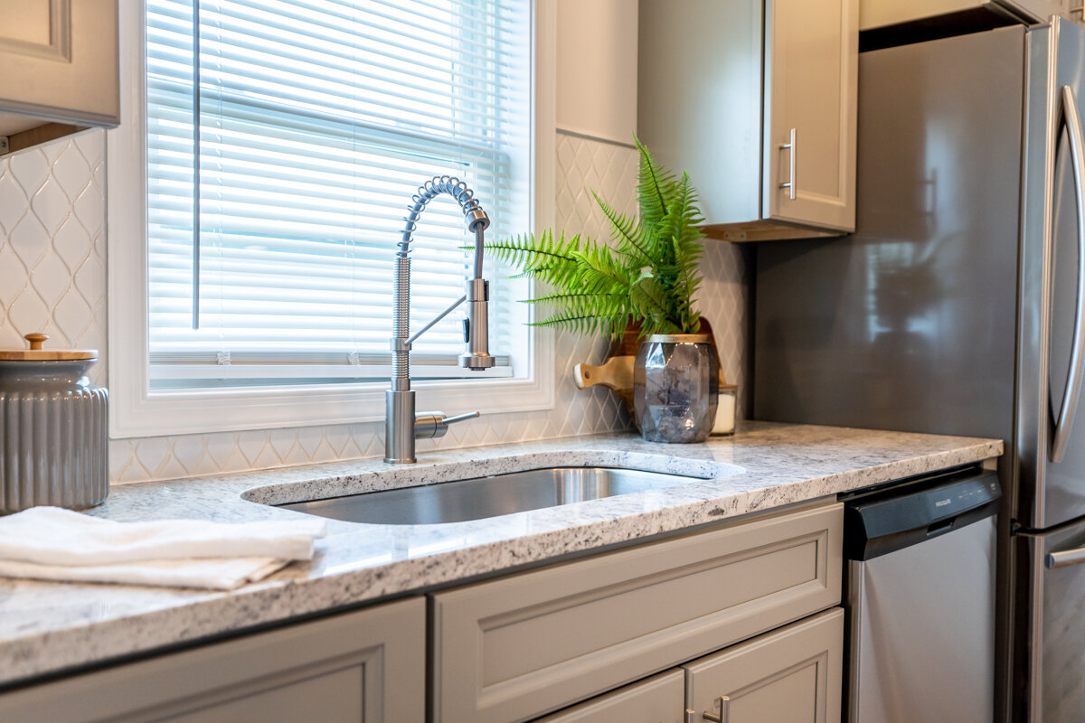
Matt’s Gray Kitchen
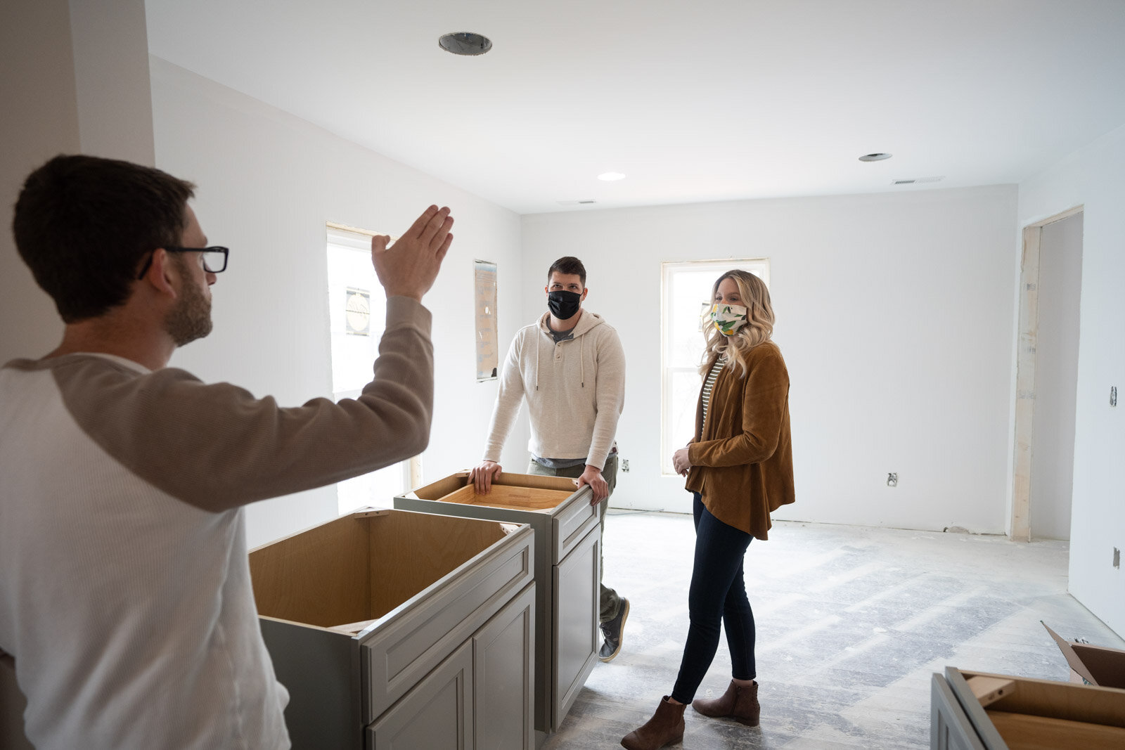
Matt showed off his choices, which he admitted were more traditional. "The gray kitchen suits my personality. I have trouble committing to anything that tends to be more extreme or specific because I don't want to regret it in the future. I go with things that are timeless. There's no way that I could regret this a year from now."
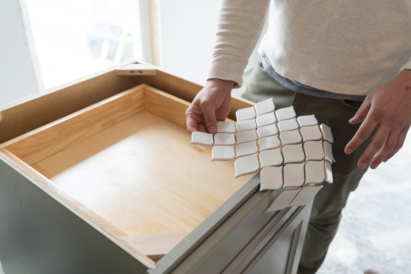
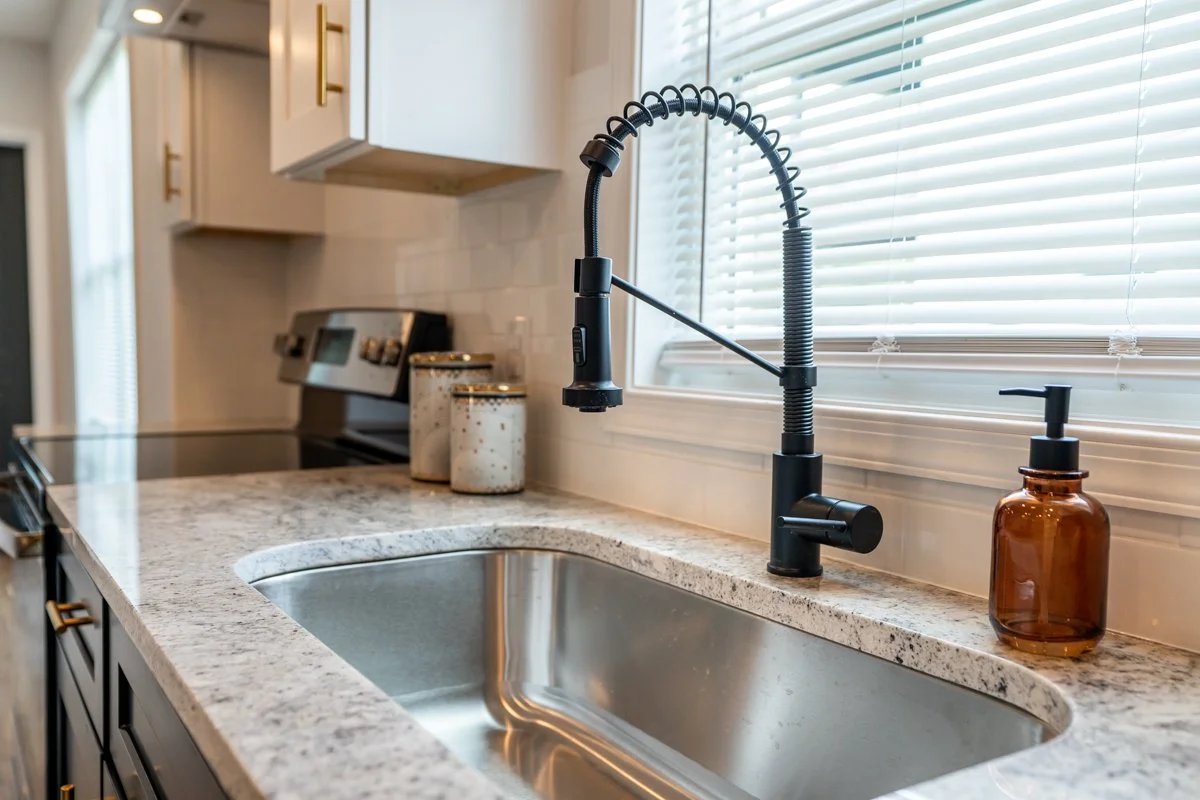
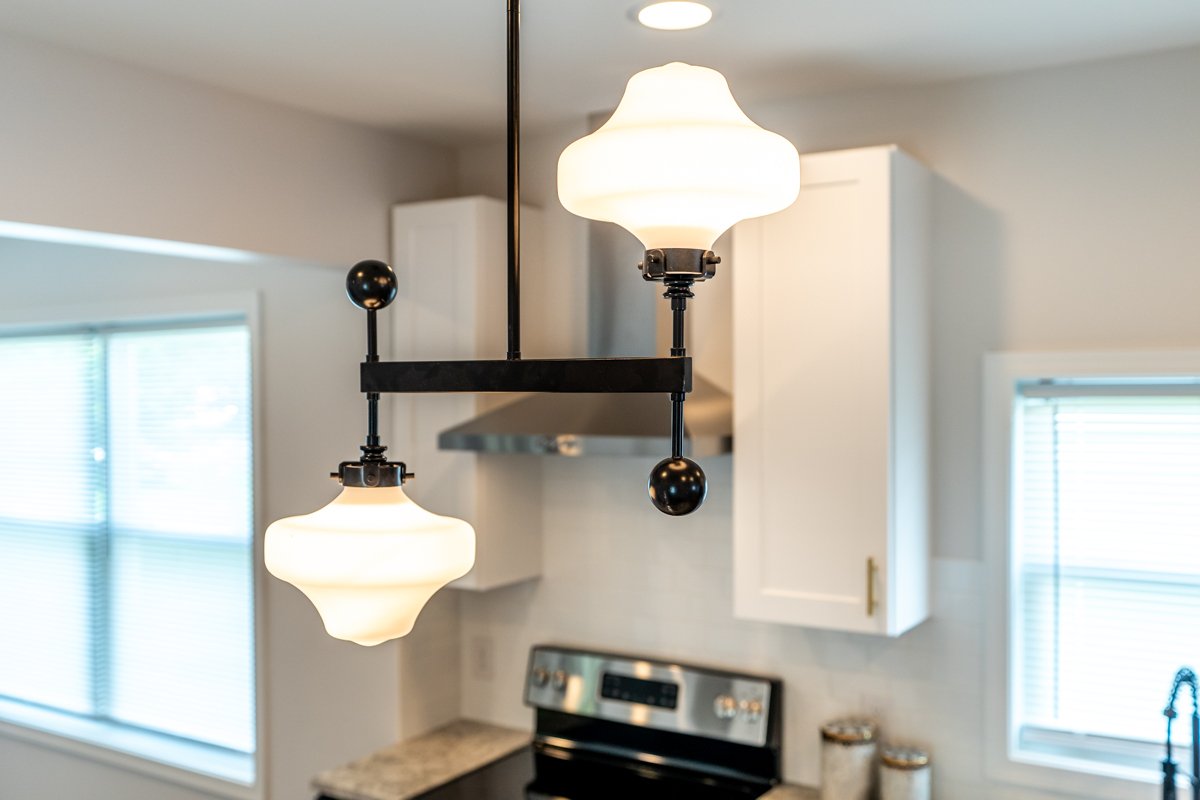
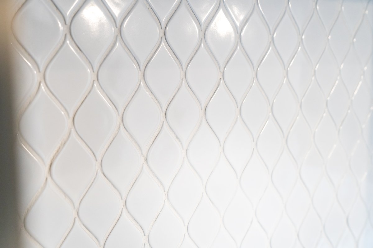
His kitchen features a granite countertop, stainless steel bar pulls, and white Arabesque ceramic tile with white grout. "We were fortunate enough in this space to have enough room for a small island. It makes the kitchen feel a lot more spacious." He also installed two retro-looking pendant lights that he thought fit with the age of the house and added a bit more character.
Kate’s Black and White Kitchen
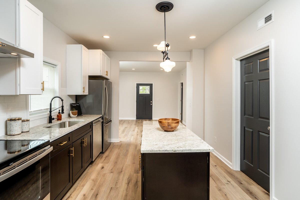
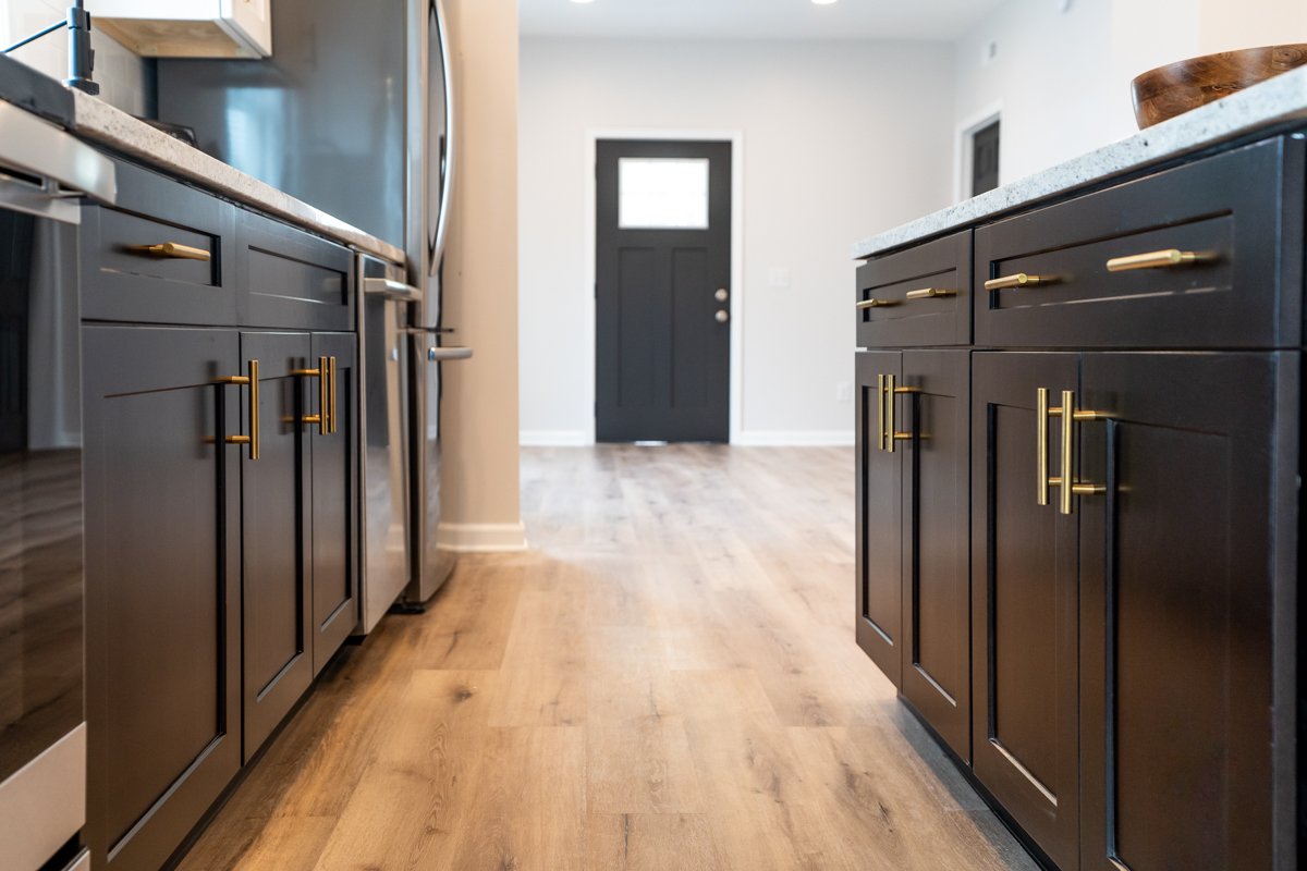
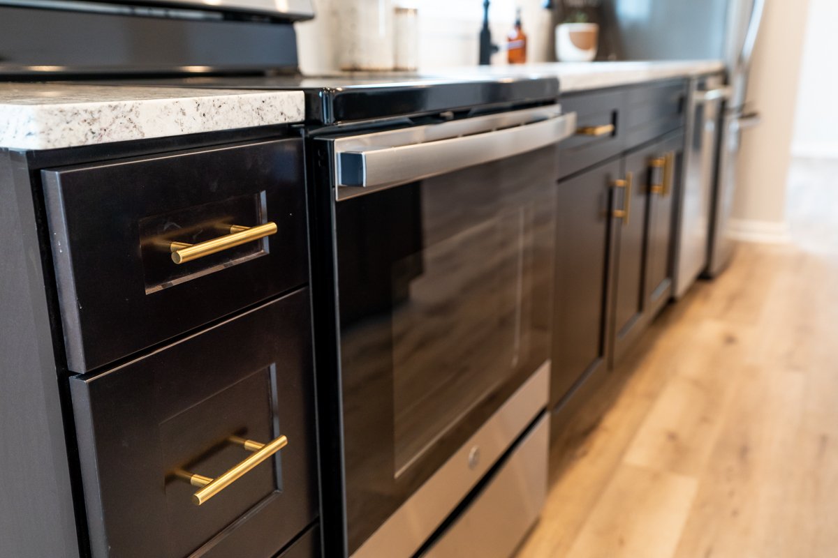
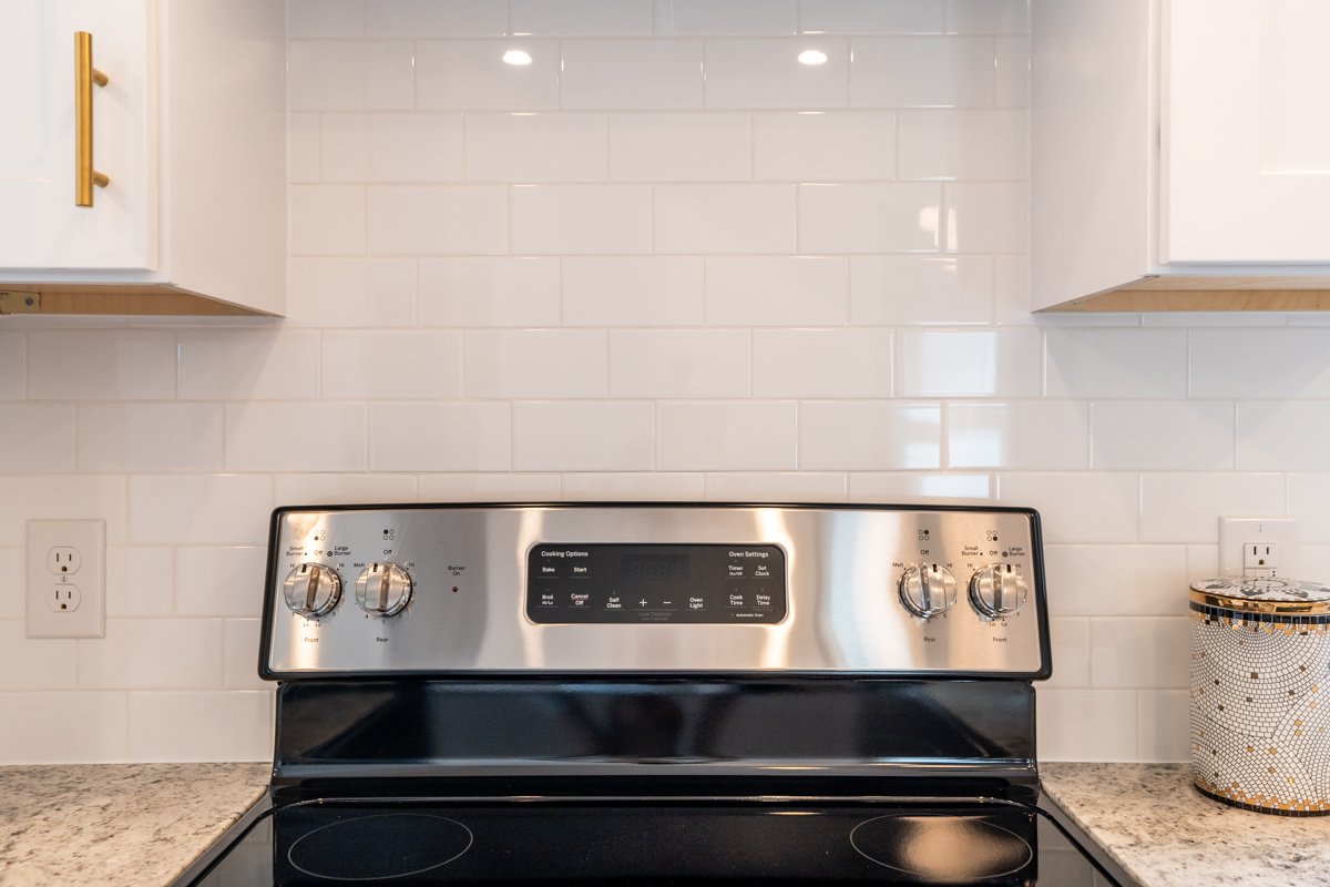
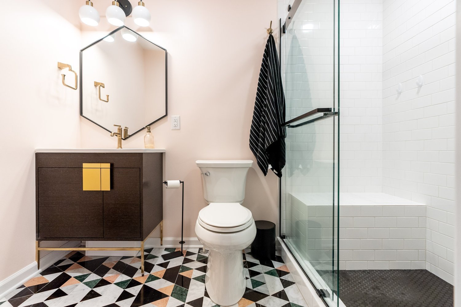
Kate's kitchen design went in the opposite direction. She opted for black cabinets on the bottom and white on top. "I thought that the brass pulls made a really big difference, really gave it some flair and some style versus the traditional chrome or brushed nickel that you see often." She selected a vintage schoolhouse lamp with milk glass, which will be difficult to replace if it ever gets damaged, but is a unique centerpiece.
Complementary Yet Unique
She is glad that they had a chance to do this and could each be artistic in their own way. "It's like our personalities. I can be extra, while you can be safe and traditional. Let's do something fun, and if we regret it, we'll fix it another time."
Matt is pleased with how each kitchen turned out. "We added our own personal flair to the kitchens. The bathrooms are identical, the flooring is the same, the colors are the same, but the kitchens fit well with those details, even though they're very different in a lot of ways."
We'd love to hear which kitchen you like better!
Completed Gallery
Let’s Look Back at the Previous Episode

A Unique Opportunity
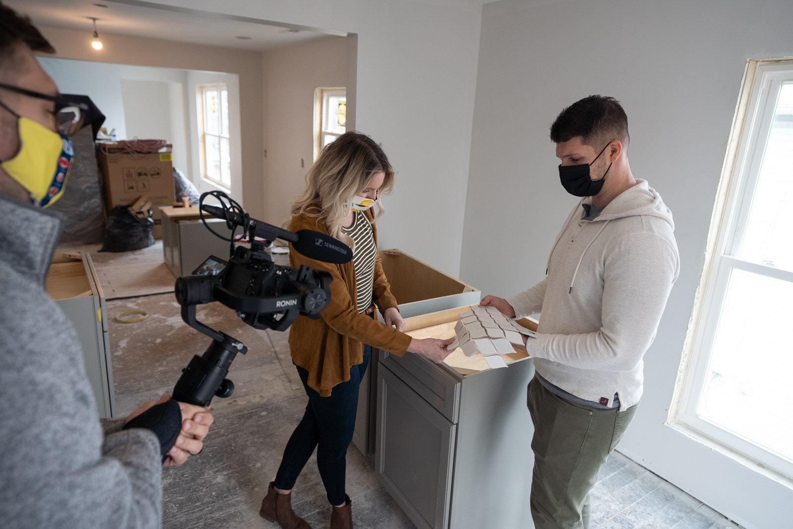
When Matt and Kate from Mint Construction began planning the renovation of this Harrisonburg duplex, they realized very quickly that they had an interesting opportunity for a design competition. The house would have to be gutted completely, and the top and bottom floors were identical. Why not each tackle one kitchen and see who would win in the battle of designer versus contractor?
"It's provided a unique opportunity for us to be able to design two slightly different kitchens based on our own design interests." Matt wanted to make sure they stayed true to the style of the home, but they had a genuine artistic difference here on what would look the best. "This is the perfect opportunity in these otherwise identical kitchens to test and see which one actually turns out the best."
Black, White, and Gray Kitchen Features
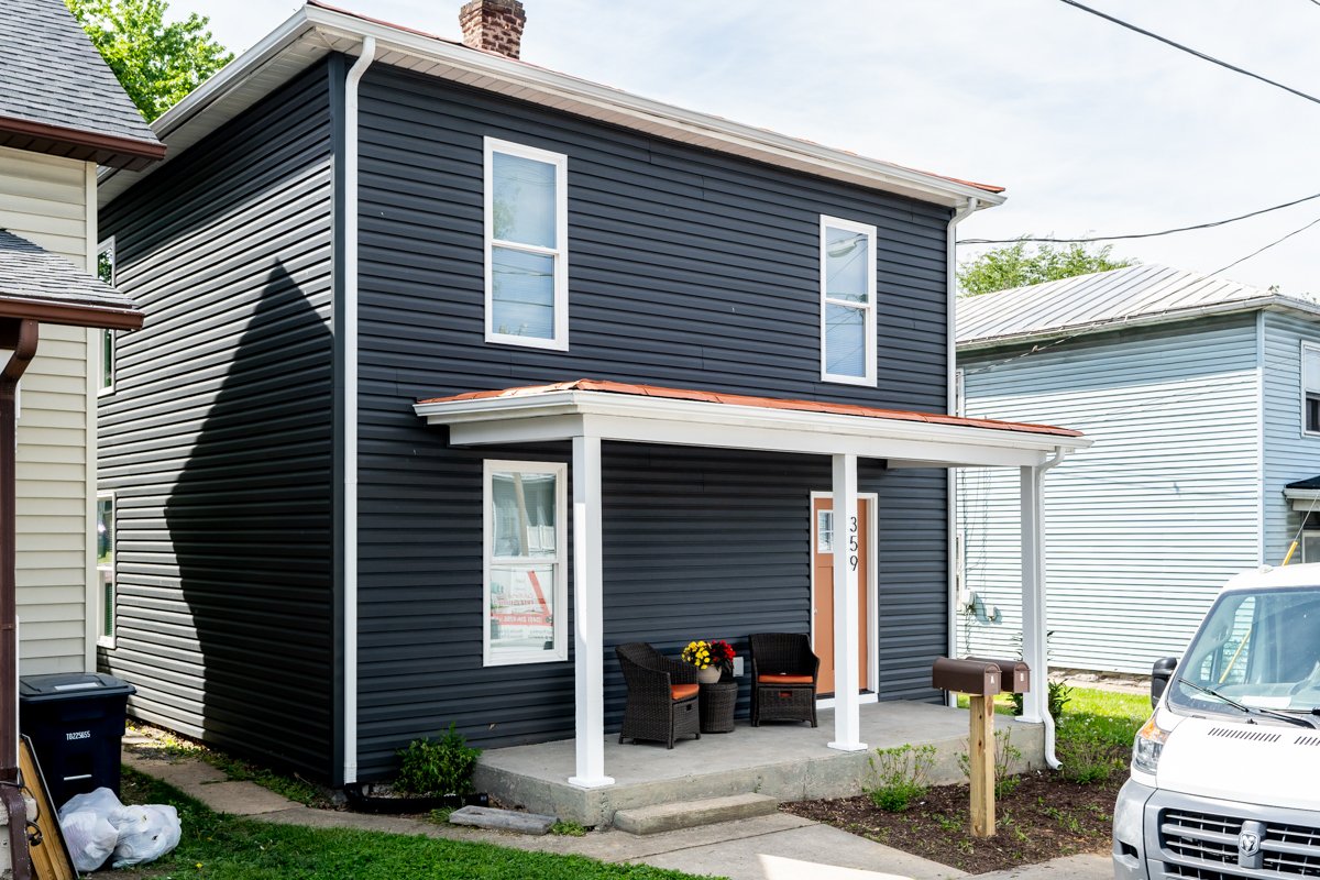
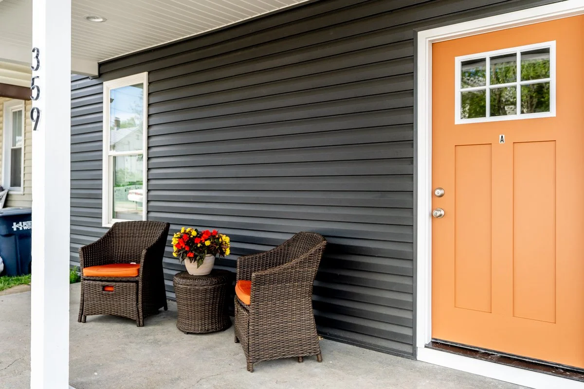
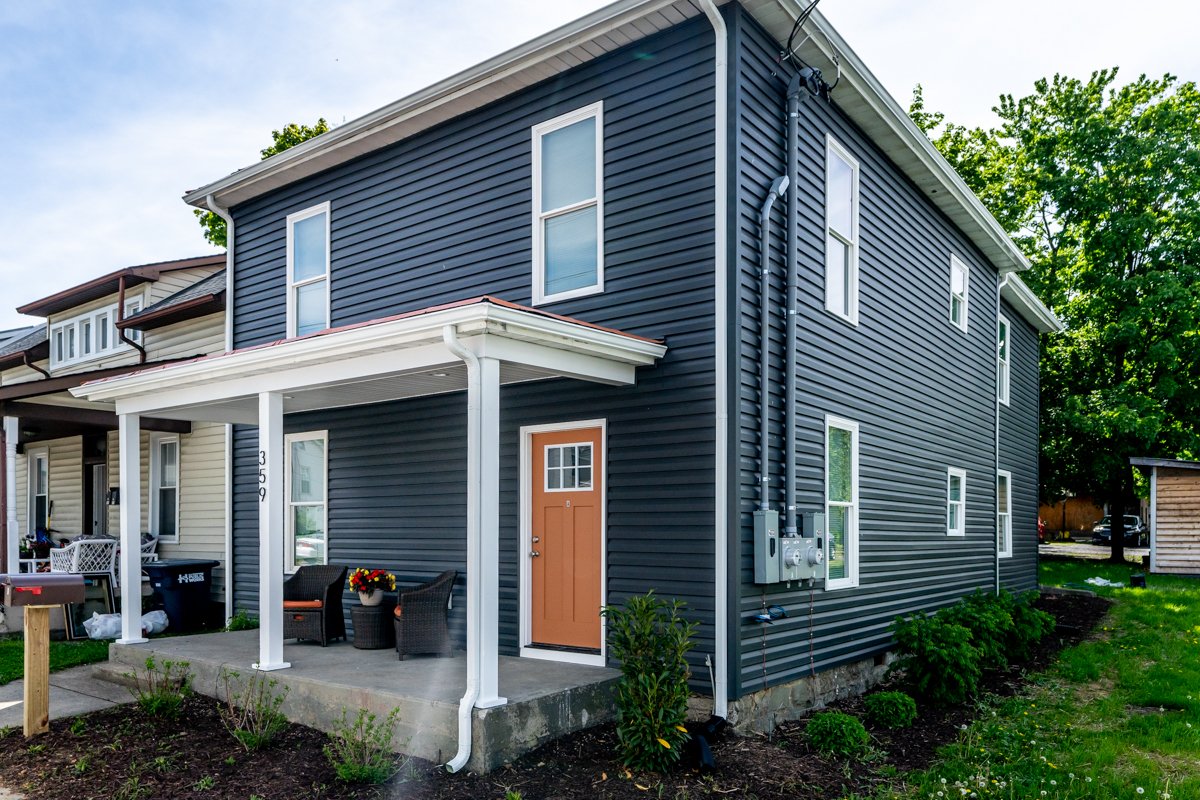
They chose a simple color scheme of white, black, and gray to match the exterior of the house. In Matt's kitchen upstairs, he chose gray cabinets to tone down the contrast of the black and white. He picked white Arabesque tile for the back splash. "If there's one risk for this kitchen is that it might be a little bit bland. I'll be looking for some way to spice it up with light fixtures or other decorations."
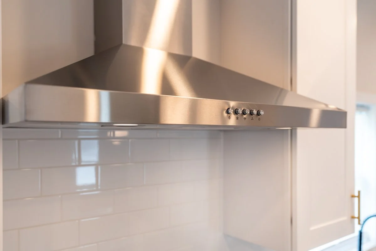
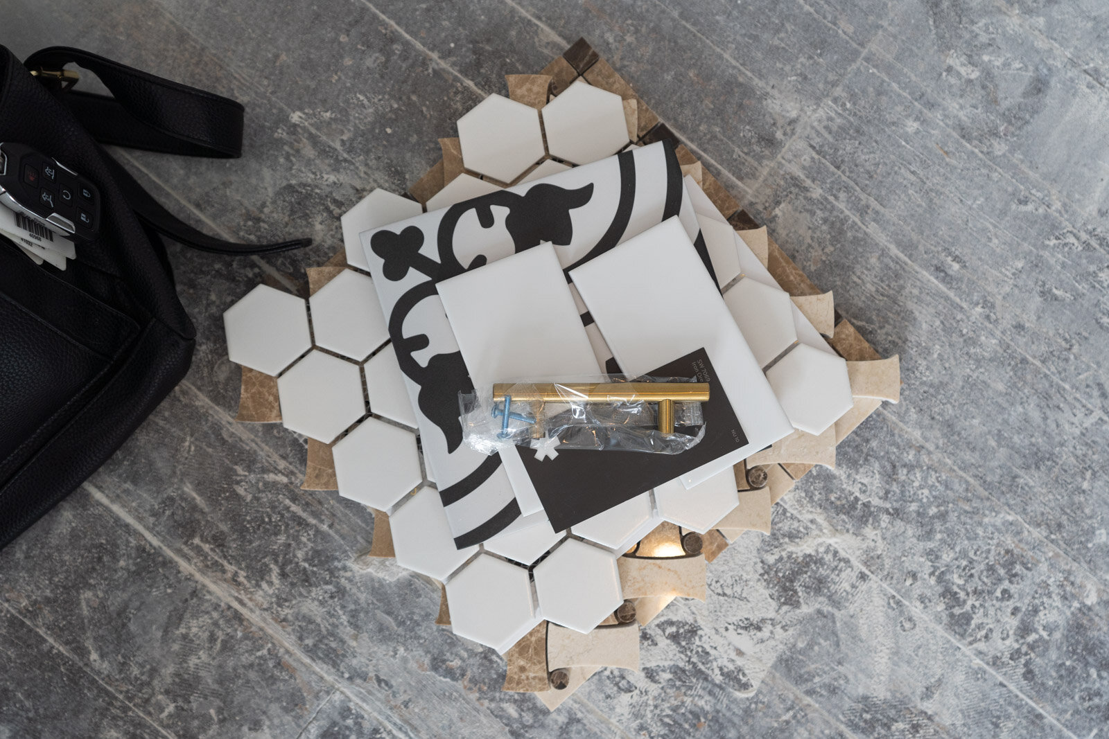
In Kate's kitchen downstairs, she planned black cabinets for the base and white cabinets for the walls. She selected white subway tile with bold black-and-white accent pieces. She focused on keeping a retro feel by choosing a light fixture made from antique milk glass.
Neutral vs. Bold
Matt and Kate are excited to see whether his neutral tones or her more bold styles work better in the space. "When we get to the end, we'll very much want to hear what other people's opinions are of this as well," Matt said.


